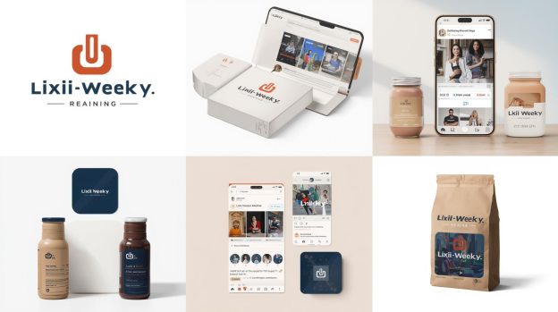
How to Design and Create An Amazing App Icon?

Mobile App Development is a very vigorous process as it includes many things apart from the main development process. If you want the users to download your application then you need to consider these things as important as the others.
For instance, you need to write a good app description, name it properly, in a way that perfectly represents it and you also need to give an amazing app icon that will convince people to click on it.
Earlier, app icons were designed purely with functionality and ease of access in mind, but today we know that a good app icon choice is based almost entirely on aesthetics.
The icon is not only the images that are necessary for marketing, but it does branding as well as self-promotion. They are tiny in structure but hold a strong base of businesses. do you want to create your own icons for strong business awareness and presence? then you just start reading the blog till the end.
So here we go.
Talk about some numbers!
Without the numbers, we can’t understand how strongly the icons are useful for the development and for the brand identity.
If we talk about the statistics, an average smartphone has between 35-40 mobile applications and if you want your mobile app development among those apps then you need an icon that makes your app look irresistible. Otherwise, you will need to wait for your application to get acquainted with the users and that can take a lot of time.
The icon of your app is the first point of engagement for a user. A great icon can increase downloads by up to 500%. With a ton of options available in the App Store and the Google Play Store, the pictorial representation of the app is important to catch your user’s attention.
You also need to remember that the first impression is the last. If you make a bad first impression, likely, your potential customers will look for alternatives or opt for your competitors. Research shows that around 90% of people put the most importance on visual factors when making a purchasing decision.
So, if you design the perfect icon you need tips to plan creative logo designing ideas so your app will easily target your target audience and your mobile application will get an amazing boost.
Best Practices for App Icon Creation
Pick Bold and Unique Shapes
We all have heard that simplicity is the key. When it comes to creating an app icon simplicity can make your app recognizable in the minds of the users. Pick a distinct and bold icon for your mobile app development and keep the rest of the features simple and minimal. However, the app’s main functionality must also be considered and somehow entered in the app icon.
Let us have a look at the Adidas Logo to understand it better.

Adidas has always been known for its simple three-stripe logo, the simplest form of which was first created in 1976. Earlier, the three Adidas Stripes were just three stripes as they didn’t have much meaning behind them because the brand just wanted something unique that would look good on a shoe.
However, in the 90s the logo was tweaked further and the three stripes were turned diagonally on their side to create the share of a mountain peak. The new design kept the basic idea of the custom logo design while giving purpose to those three stripes, which now represent the struggle athletes must ensure to achieve greatness.
Avoid Using a Photo
By asking to avoid using a photo, we mean not to include any photo off the internet even if it offers a bold and unique shape. However, if you like a photo that is simple, bold, and represents your brand, or even create a vector image version of it.
There are a few app icon creators which you can use for your android app development. This application creates the icon by sharing the purpose of the application. They give you the image illustrated and add a letter to it, improving the overall appearance of the icon and making it more memorable.

Don’t overload the Icon
As mentioned earlier, you need to keep in mind a few things when it comes to designing your app icon. So, you also need to keep in mind that the app will appear smaller on the user’s screen. This makes it important not to fill in too many colors or too much detail could hinder your app from standing out. We suggest you limit yourself to two or three colors and one design.
For instance, The Snapchat app icons have a simple color palette and design. You can see that there are two main colors: white and yellow with a white-colored small ghost in the background. The color palette for the icon should be the same one you use in the design of the actual app, and it should attract your audience.
Don’t Include Words
Your app icon is going to look small on a smartphone screen, meaning that users will pretty much need a microscope to read any text you place on the icon. That is why it’s best to leave the text out of your icon design.
If you create an effective app icon and name your app something appropriate, that will be enough to draw people in. Then, they’ll be able to look at the app description to learn about what it is and what it does.
Add Border to the App Icon
If you remember we talked about the Snapchat icon where we can see ghosts with a border. Well, you can also put a border around the entire icon image. The border helps in creating more impact for your icon because it emphasizes the content inside the border, making it stand out more in the app store.
Which can eventually increase the number of downloads. You also need to keep in mind that the border you use around your icon should have a strong color that contrasts well with the colors which are inside the border.
Look at your Competitors’ App Icon Designs
If your competitors are successful in the current field then you must take inspiration from them. You’ll be able to figure out which app icon features are needed. For example, let’s say you are creating an app for users who want to check and organize their emails. Your best bet is to look up other email apps to find out what kind of design your competitors use.
To stand out from these competing applications, you need to consider choosing a different color based on your brand and target audience. You can also get creative to choose a symbol that represents your business.
Create Several App Icon Variations to Consider
When it comes to app icon designing for your mobile app development company then we suggest you brainstorm and give yourself several ideas to consider before finalizing your app. When you see your application icon sketches side by side it becomes easy for you to determine which app icon features you need to incorporate as it will look perfect.
Why your icon details is crucial for your phone screen?
When you are designing your app icon, you also need to consider how it will look against the colors of mobile device wallpapers. Most of the users have some unique wallpapers, so you want to make sure your app looks great against a range of dark and light backgrounds.
Some of the users also consider live wallpapers for their phones so you must make sure your mobile application will always pop up in this scenario.
You also need to think about how the app looks in general on a phone screen too. If it is too detailed to be recognizable or doesn’t look clean from a design perspective, you’ll need to make some required changes.
App Icon Must be of the Right Size
While creating your app icon, it needs to be the correct size as per the screen on which it needs to be viewed. And this isn’t an optional step. Another thing you need to consider is Apple won’t even accept your app icon if it isn’t the right size.
So, we suggest wherever you plan to release your app, look for their required app icon guidelines so you can follow them to make sure that your app is accepted.
Options for Creating your Own App Icon
There are many free app icon makers online that you can use for app icon design. However, you need an original idea so we suggest you avoid having to work within the constraints of the free program. Let us have a look at the other options.
Adobe Illustrator
You must have heard of the efficient Adobe Illustrator as it offers some amazing functionality and aspects which can help in designing a vector image to use as your app icon.
Once you have sketched your app icon ideas, choose the one you want to work with, and import the sketch into illustrator. So you can start designing your icon based on the sketch.
Hire Graphic Design Firm
If you are finding it difficult to design the app icon by yourself then you can hire the top graphic design company which knows how to design a logo that resonates with your target audience and one that looks amazing in the app store.
Look for the Right App icon Design services – Look for an experienced app icon design company like VerveBranding. They have a deep understanding of app icon design best practices. So look out for the companies that have a portfolio full of attractive app icons.
Or you can simply check out the factors that need to consider before hiring a logo designer.
Look for Testimonials – Look for the designer’s previous works and previous clients and whether they are happy or not. There’s a good chance that you’ll be happy with your app icon design.
Conclusion
As you have all the information you need to design your app icon in a way that will attract many new customers. Once you have the amazing app icon you will be able to release your app and watch as its unique icon design attracts you.
There are a few standards of app design that need to be considered so your application gets submitted on the first try and earns a lot of revenue.
VerveLogic can be your one-stop solution for mobile app development and web development because we have a team of experts and market experience. You can get your app or website developed at the best price possible.
Also, if you are looking for branding solutions or online marketing for your brand then you should check out VerveBranding and Verve Online Marketing today and make your brand stand out.
We hope we have solved your every query regarding the app icon and how to create an amazing app icon. Let us know in the comments and questions.
Also Read: 6 Logo Creation Tools that You Should Start Using Today
How Much Does It Cost To Develop An App


Directory submission is entered into the top-off page SEO process which allows us to provide your business data to your site URL.
Nice information about app creation