Brand Colour Trends for 2026: What’s Next After the Current Palette
What makes a brand unique?
Their logo?
Their USP?
The colours on their website?
If you ask us, it’s everything!
Starting from their colour palette to their logo design, everything makes a brand, ‘brand’.
Till 2025, we saw a major shift in brands as they prioritised soft pastel colours in their logo design, marketing banners, brochures, and website. Every brand chooses the colours based on what it feels will sit well with the audience. For instance, a brand catering to Millennials uses soft and elegant neutral colours, while a brand serving Gen Z uses loud, bold colours like deep red and bright yellow. However, it’s not necessarily true for every brand.
Going forward, brands are basing most of their decisions on their target audience. So let’s see which colours are currently ruling the industry and where the colour palette shift is going.
Colour Scheme in Branding
The brand’s colour scheme has a significant impact on brand perception, user experience, and the overall visual storytelling that appeals to your target audience. Maintaining consistency in colour scheme means using the same set of colours to create marketing materials, logos, websites, etc, so that the audience can recognise your brand just by looking at the colours.
Why is Choosing the Right Brand Colours Important
It is crucial to select cohesive brand colours that align with your overall brand identity and target audience.
Colours are how your customers are going to recognise your brand, and a consistent colour scheme helps you align your brand messaging and values together. So, it’s very crucial for overall brand identity development.
Establishing the right colour contrast for your brand improves readability. The colour harmony looks good to the eye. Hence, it’s important to look at it as one of the major factors when choosing the brand colour. For instance, choosing light colours to do typography affects readability and makes it difficult for users to understand what you’re trying to convey.
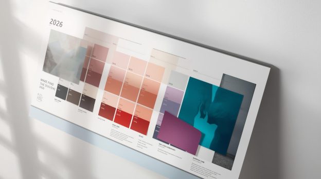
So, Which Brand Colours will be trending in 2026?
Your final brand colour palette will depend on several factors. It includes determining –
- Who is your target audience?
- How do you want your audience to perceive you?
- What values are you delivering?
- Who are your competitors? And the colours chosen by competitors?
For instance, if you’re trying to build a professional image of your brand, using colours like grey and deep blue will give it an energetic and fun vibe.
If your brand is catering to a particular audience, choosing colours that align well with your target audience’s demographics, cultural background, and beliefs will give you a unique image in the industry.
Bottom Line?
When choosing a colour palette, you must understand the importance of maintaining a visual hierarchy and balance. You should use a strategic mix of colours with one as a dominant primary colour, and others as accent and secondary colours. Creating a compelling brand identity is our speciality at VerveBranding, a leading logo design company in Los Angeles.
So let’s connect and deliver a major brand transformation that not only catches your audience’s attention but also ensures competitive growth.