Colour Psychology in Branding: What Every Brand Should Know
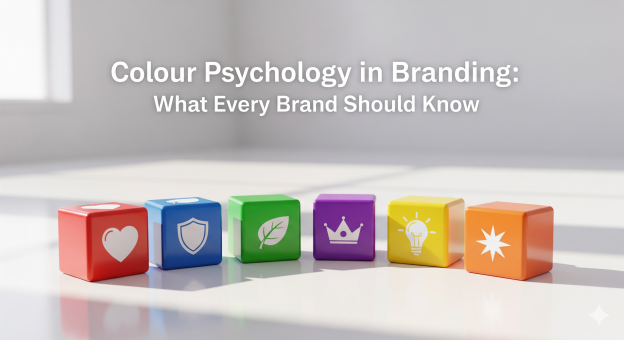
Colour psychology is an important aspect in branding as it drives customers to make a purchase decision. Every brand has at least one colour that represents its brand identity. Colours can impact decision-making to a great extent as they evoke the feelings of warmth, trust, happiness, sadness and much more. Brands use colour psychology to create a visual perception about themselves in customers’ minds. This changes the way they look at the brand and interact with it.
Colours have an important role to play when it comes to branding and marketing. If you are feeling calm in the presence of blue, it is because it has such an effect on humans. Just as the same, yellow colour exhibits happiness while red colour alerts you of possible dangers. It is all about colour psychology in branding and marketing. 90% of the product impression is influenced by the colour alone, which is why brands must focus on associating their products with specific colours that represent their brand as a whole.
When you use colour psychology in marketing, it helps customer retention and builds brand recognition. In this blog, we will understand what each colour exhibits and how it influences decision-making and customer behaviour towards the brand.
How Colour Psychology Matters?
The brands that know about colour psychology have a better opportunity to build a positive brand image in customers’ minds. Let’s see how the audience perceives different colours in a brand logo and the way brands use colours to create a positive brand image.
Significance of Yellow Colour in Reflecting Brand Positivity
There is a huge influence of colours on the brand image. Colours convey important messages about the brand to customers.
For example, yellow is considered the colour of the sun, which evokes feelings of warmth, clarity and optimism. In addition to that, when it comes to psychology, yellow is considered a rich colour that is associated with happiness and brightness. The golden arches in the McDonald’s logo are in yellow colour as well, which highlights a vibrant and kid-friendly vibe.
Similarly, the Subway logo uses yellow colour that highlights positive energy, joy, and the intriguing flavours of their food. The touch of green colour in their logo is representative of the healthiness and freshness of their ingredients.
Significance of Orange Colour in Brand Image
The orange colour in the logo and brand marketing materials symbolises creativity, warmth, enthusiasm, and positive energy. To convey the message of playfulness and affordability, Orange is the ideal colour there is. It is eye-catching, bold and significantly energetic colour that evokes the feelings of confidence, imagination and adventure in customers.
The brands like Fanta and Nickelodeon use the orange colour in their brand image that reinforces their brand identity. The value and affordability associated with the orange colour appeal to value-driven customers who prefer budget friendliness and prioritise quality over anything.
Significance of Blue in Branding
How many brands do you remember that have a blue logo? Do you know what a blue logo signifies other than deep ocean calmness? We see the blue colour in healthcare agencies and health-related brands. Apart from it, you must have seen the blue colour logo and branding material in companies like IBM, Dell and Intel. Blue colour signifies professionalism, calmness, dependability and stability. IBM and Dell present themselves as trustworthy brands.
Keeping the blue colour association with the brand helps you create a positive brand image. It instils long-term brand loyalty as it is the colour of dependability and reliability. Creating a strong brand image associated with the blue colour creates a secure atmosphere and places your brand as the most reliable.
To Sum Up
The association of green colour is with the idea of growth and peacefulness. Similarly, purple colour is associated with royalty and mysticism. There is utmost importance of colours in creating a positive brand perception. Choosing the right colours to market your brand can help you build authority, reach a potential audience and encourage them to trust your brand. How customers perceive different colours associated with the brand depends on their cultural differences, their experience, their personal preference, upbringing, as well as context. However, the individual meaning of colours fades away in the background if you are brand colour is appropriately fitting to what you are selling.
Hence, choosing the right colours for your brand is highly important so that you can create a coherent relationship between your products with that specific colour. For sophistication, you should use charming and upper-class colours; for reflecting competence, you should use colours that convey intelligence and reliability. Similarly, if you want to convey strength, energy and power, you can choose colours like red and orange. To create a custom colour palette for your brand, you need a proper understanding of brand colour psychology. You can build your brand recognition by choosing appropriate colours that rightly convey your brand messages to the audience. To achieve this, you can reach out to our designers at VerveBranding, a leading logo design company in India.