Branding Mistakes That Kill Shelf Appeal (And How to Avoid Them)
In this fast world of the internet, you have only a fraction of a second to grab customers’ attention.
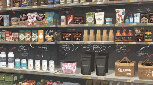
Whether you are selling in physical stores like boutiques or supermarkets, effective and eye-catching packaging designs will have a better chance of getting picked from the shelf rather than old, boring, ineffective packaging designs.
Packaging is very much a part of branding, and brands need designs that make their product feel trendy and something that customers would want. So instead of choosing outdated, cluttered and less visible packaging designs, get the professional logo design agencies to take over and help you create viable packaging for the shelf that appeals to customers.
Let’s see how to fix the mistakes first –
1. Overly Cluttered Packaging Design
When customers lay their eyes on shelves, trust me, they are looking for the finest packaging. By fine, we mean clear, eye-catching and clutter-free designs where they can actually understand what the brand delivers. So don’t overcrowd the design and include essential information on the packaging that conveys the key information to the customers.
2. Ignoring Colour Psychology
There is a huge influence of colours on the buying behaviour of customers. If the colours are not as effective or don’t align with your product well, customers might skip it. Every brand has a unique colour scheme which should be used on all marketing materials and packaging designs to build memorability. You should use brand colour shades that differentiate your products from competitors, while also reflecting your brand personality.
3. Missing Functional Details on Packaging
In the process of maintaining packaging aesthetics, don’t ignore the functional details. If the packaging material is flimsy, hard to open and has leakage, it’ll ruin customers’ buying experience. So use high-quality sustainable packaging material and don’t compromise with its functionality because it directly impacts your brand image.
4. Unclear Typography
If customers can’t read and understand what’s written on the packaging, it’s poor typography. The text style you choose must be coherent with your overall brand identity. The texts must be clear to read, and the package design must show a clear contrast of text with background colour to highlight important messages.
Bottom Line
Your product packaging says a lot about your brand and its overall personality. The package design must communicate the important messages about the product so that customers are compelled to buy it. So don’t waste your valuable time on something that can be handled by well-taught and experienced professionals. Choose a renowned logo design company in Los Angeles, VerveBranding, where expert logo designers and packaging designers will help you create compelling designs to woo customers right from the moment they lay eyes on the shelves!