How to Use Brand Icons & Symbol Sets Beyond the Logo
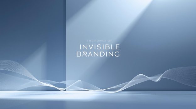
A logo is the most powerful symbol for brands because it’s how people recognise them, but modern branding goes beyond a single logo.
A logo is not only for your website, the brand icons and symbols also go hand and hand with the logo. These elements work together to tell a cohesive story about your brand, brand values, brand personality and the brand narrative to the core audience across every touchpoint.
Partnering with a top logo design company can help brands create strong visual systems through which you can strengthen brand recall even when the main logo is not present. But first, let’s understand how the brand icons and symbol sets are used to guide navigation in apps.
Logo, Icons, Symbols and Typography: The Core Branding Elements
Brand icons are highly versatile, even more than logos. Through brand icons, you can guide users on the website and application. You can use them on packaging, presentations and in simplifying product explanations. If you use the brand icons and symbol sets accurately, they can strengthen brand recall and also improve brand memorability.
- Brands are using symbol sets, icons and logos to give visual cues to the users so that they can understand how to access and navigate applications and websites. For example, using a consistent ‘Home’, ‘profile’, and ‘Settings’ icon works as a standard navigation guide inside a website.
- There are actionable items as well, like creating a unique icon for ‘share product’, ‘place order’, ‘build a cart’, etc, through which users recognise the action.
- The brand symbols and icons are used in social media posts, infographics, brochures, flyers, campaigns, graphics, and presentations.
A Step-by-Step Guide to Standout Visual Identity
Brands now collaborate with top logo designing firms to create custom icon libraries that match their colour palette, typography, and tone, all of which are important to create a consistent brand image.
The icons are not generic; they are uniquely related to the brand image. For example, a cosmetic manufacturer uses rounded icons and soft green colours to highlight calmness and nature. On the other hand, a fintech brand uses geometric shapes and sharp edges to highlight accuracy and precision.
Bottom Line
If you want to showcase ‘professionalism’ in brand, collaborate with a top logo design company in Miami, like VerveBranding, to create a multi-layered brand identity where the symbols, icons, lines, typography and the logo itself tell the entire brand story.