Logo Design Trends for 2016 – The Broadcast
The art, chemistry, biology and physics of logo designing is changing rapidly since now Logo Design Company are more devoted to engaging customers in the digital market. If we consider the frequency of engagement, then its quite good, while the quality of engaging consumers has turned into more personal and inclusive as well.
Keeping everything aside, today we are just going to focus on logo designing. In current market, there is no space for the conventional approach of logo designing. There are many individuals who are studying the emerged changes, patterns, and the trends that are occurring in logo designing. And after coming to the conclusion, we can have a comprehensive idea about the logo designing trends that are extremely popular in 2016.
So, take a look at these trends and work for your business logo accordingly:
#1 Flat Designs
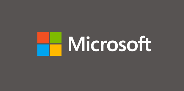
The trend of flat designs is quite appreciated these days, and it is going to maintain this pace. Due to their clean and forthright outline, the logos with flat designs registers well in any sort of browsing device and loads faster. Besides that, flat designs enable the companies to become easily identifiable and perceptible.
#2 Handmade Logos
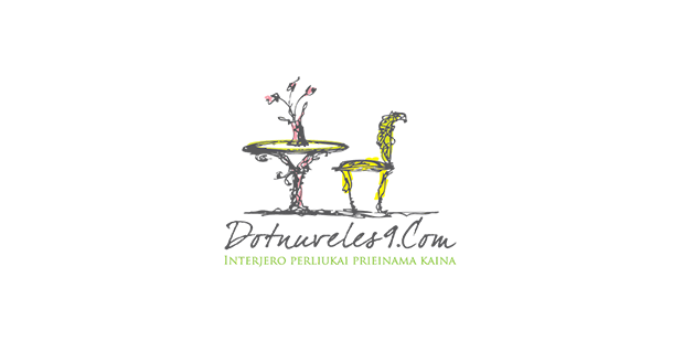
Handmade logos speak honest words. Somehow, these designs directly connect with the person. We know that the aura of the digital market is in full swing, but many love to be in the appeal of handmade fonts and designs. This style is useful for brands, reflecting minimal craft as well as a lighter approach when it comes to imprinting. In addition, with handmade style, the designer can play with a range of colours in order to create free toned logos.
#3 Dynamic Logos
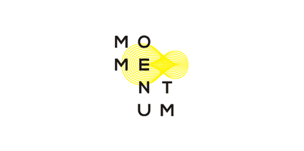
This trend in logo designing is also popular as kinetic logos. The dynamic logos reflect those designs that changes but remain the same with greater appeal. Perhaps the style seems fresh or it becomes excessive personal. Internet Marketing Company shows their extreme interest in dynamically designed logos.
#4 Negative Space
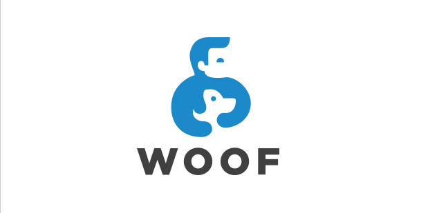
Negative Space isn’t the new trend, but it is hitting the place again this year. This style reflects the design which speaks to you when you see it first and tells you what it is actually about. Like this way, this style works tremendously. In case, the negative space conveys more message than this and the consumer is able to pick the details in deep, then it has become more special. Thus, this is the reason why negative space is continually scattering its strengths.
#5 Mono Lines
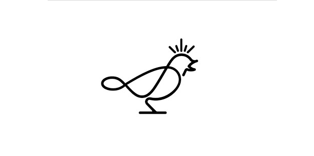
The logos outlined with monolines or thin lines show their fresh and clean designs. Last year, this trend introduced the new standard of logos, and now in the current year, it will surely go far, revealing a more expressive nature. In logos, the monolines comprise the constant thickness in single solid colour. Usually, the designer picks the colour black. This style is typically popular in the coffee or food industry. The designs seem simple but contain artistic graphics making them a little playful.
Final Thoughts on Logo Designing Trends for 2016
Moving a brand in the modern era with an appealing logo design seems a strategic task, but it’s not that complicated. With a solid grasp on logo designing trends and outstanding resources, designers or brands can leg up in front of their competition.
So let us what are your picks for logo designing trends!




Hi Heena, great post you have shared about the logo design trends. I really like flat design trend and it’s clean surface, two-dimensional, open space, bright colours we can see on these four logos.
Hey David, Thanks for sharing that post, that’s really helpful..
I learn new things from your post. Thanks.