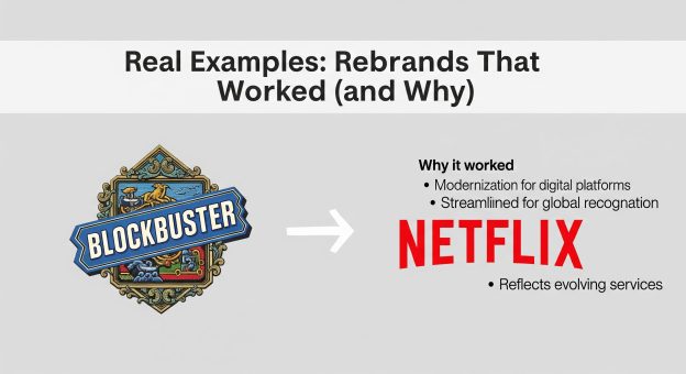
Real Examples: Rebrands That Worked (and Why)

Which successful brand names do you remember in the past 10 years that have gone through major transformations? Yes, we are talking about rebranding, where brands change their identity by either repositioning the brand, changing the logo, changing the target audience, adding a new brand slogan, etc. While rebranding, you need to follow some do’s and don’ts.
Rebranding is the process of re-establishing the brand with minor tweaks and changes. Customers will be able to reconnect with the brand if promoted through the right marketing channels and tactics.
In this blog, we will understand why rebranding was important for some major business tycoons. We will also dive into understanding how some of the major brands we know have rebranded successfully in the past.
Which of These Following Brands Do You Know That Rebranded?
#1: Starbucks Stripped Down Their Old Logo, Do You Know Why?
Do you know why Starbucks had to go back to basics by redesigning its logo after carrying its traditional mascot for over a decade?
Starbucks is widely recognised as a coffee giant. One day, people encountered a new brand logo on the Starbucks coffee mugs and instantly thought that the new image was simplistic and boring. But Starbucks mandated that their logo be published on all major packaging and deemed it necessary as part of their rebranding strategy.
Starbucks was following a restrictive brand logo for decades, which focused on only one thing: coffee. But after significant additions and changes in their menu that focused on other beverages and food items beyond coffee, they needed a brand transformation. After adding new menu items, Starbucks didn’t want to be associated just with “coffee”. Starbucks stripped down their logo design and added only the bare essentials to support its expansion in major cities and countries all over the world.
#2: Instagram Transformed Its Identity through Logo Redesign
Note that Instagram rebranding occurred when it was widely known as the “most successful” social media platforms ever. The majority of Instagram users comprise Gen Z and Millennials.
Instagram introduced its rebranding in 2016. There was a mixed reaction to the new brand image of Instagram that left some users confused, some happy, while some hated the new logo design. At the time, people felt that there was no need for rebranding, but the brand thought otherwise.
Instagram went ahead to change the old logo design because it was too old-fashioned. It only showed Instagram as a photo-sharing platform, but the company realised that it was more than that. To give a modern look to the platform, Instagram launched a flat design icon that reflected the product portfolio and new vision of the company. Later on, the icon became the brand image and succeeded in creating a new perception in users’ minds.
#3: Airbnb Went Through Major Brand Transformation and Succeeded With Flying Colours
Airbnb is a global vacation house rental company that provides a great alternative to hotels.
Airbnb was founded in 2012 and offers online vacation rentals to customers in the hospitality industry. Customers can easily rent an apartment and even an entire house when on vacation. Airbnb offers a unique experience to users, which is completely different from what you get at a hotel.
Airbnb launched its new logo as part of its new marketing campaign, “Belong Anywhere”. Through this, Airbnb wanted to showcase that their brand represented places, people and love along with the letter A that stands for “Airbnb”.
By strategically combining the letters, the company centred their rebranding efforts around community building and delivering their brand story. Airbnb wanted people to perceive them as a company that does more than renting places. It delivers an experience and lets people live as locals wherever they go. Through this rebranding strategy, Airbnb connected deeply with customers’ emotions. They leveraged storytelling strategically in their rebranding process, which was very successful.
#4: Do You Remember the Pepsi Rebranding for Better Market Reach
You must know that the biggest rival of Pepsi is Coca-Cola. On one hand, you will not witness any rebranding in Coca-Cola since the 1980s, which is a similar beverage brand, but Pepsi implemented some minor tweaks in its logo several times.
However, the rebranding by Pepsi in 2008 was the biggest of all Pepsi’s rebranding strategies, which included redesigning its logo. Pepsi gave a more dynamic and softer look to their logo design. Pepsi wanted to highlight energy intensity and movement through its logo, which aligns with younger consumers and demographics.
In the newest Pepsi logo, they included a smile into the traditional Pepsi symbol, looking like a globe. Pepsi wanted to reposition its brand as a contemporary brand. In spite of the large pricetag, the focus of Pepsi’s rebranding efforts was on refining the brand message delivered to consumers. They want to focus on “living in the now” and “happiness” through their brand messages. The new brand image of Pepsi gives an energetic vibe that resonates with a younger audience on social media and other platforms.
To Sum Up
What we learnt from Pepsi’s rebranding strategy is that in order to separate yourself in a saturated market, you can evoke new sentiments in customers. Pepsi achieved this by adding minor tweaks to the logo design. Brands leveraging rebranding should focus on storytelling. Customers can emotionally connect with the brand if it has a compelling story.
If you are looking to rebrand, you can contact our brand strategists to develop a tailored rebranding strategy for your business. At VerveBranding, a leading logo design company in India, our experts deliver branding solutions, social media advertising, logo design, product packaging design, etc.


