10 Best Construction Logos and How to Make Your Own
Are you looking for your company’s logo design? What are some of the top logo designs for construction logos? Who can help me with the best logo design services? Should I hire a logo designer for my construction logo design? What are some of the top construction logo designs?
Who to hire for a logo designing freelancer or logo design company? In this article, we have discussed logo design for construction companies. Which will help you with the best information for your company logo. Read here to know all about construction logo designing for you.
We have said many times that every business is affected by its logo design. No matter what industry you serve in, an effective logo can positively affect youriness and bring in more customers to you. As a leading logo design company, we get a lot of inquiries about the current trends of logos from different companies from different industries. So, we thought of sharing our insights on different kinds of industry-specific logos and what might work for them and what not by looking at the logos of some established companies. Last time we covered the history of the Starbucks logo and the elements that make it perfect. So, today we are going to talk about the top 10 best construction logos and how to make your own logo.
Now when it comes to logos for construction companies, most of you might think that they must look tough and gritty to showcase the image they portray. But the logo is the place where you are allowed to be creative, and use stylish and modern ways to announce yourself in the market. That’s the whole point of this blog as they are going to showcase some of the world’s biggest construction companies with the most creative and visually impressive logos. They know how to attach creativity to the logos that represent their companies and because of this they attract customers from all over the world.
Moreover, when it comes to the world’s biggest construction companies then they do not worrsveralseveralir logo for customer acquisition. Rather they are turning down work rather than looking for more. It’s the small group and construction companies that require brilliant logos as it can help them communicate with the people who walk past a construction site. With a powerful logo, you can even inspire people to move forward and automatically connect with you rather than going to each house asking for the new construction.
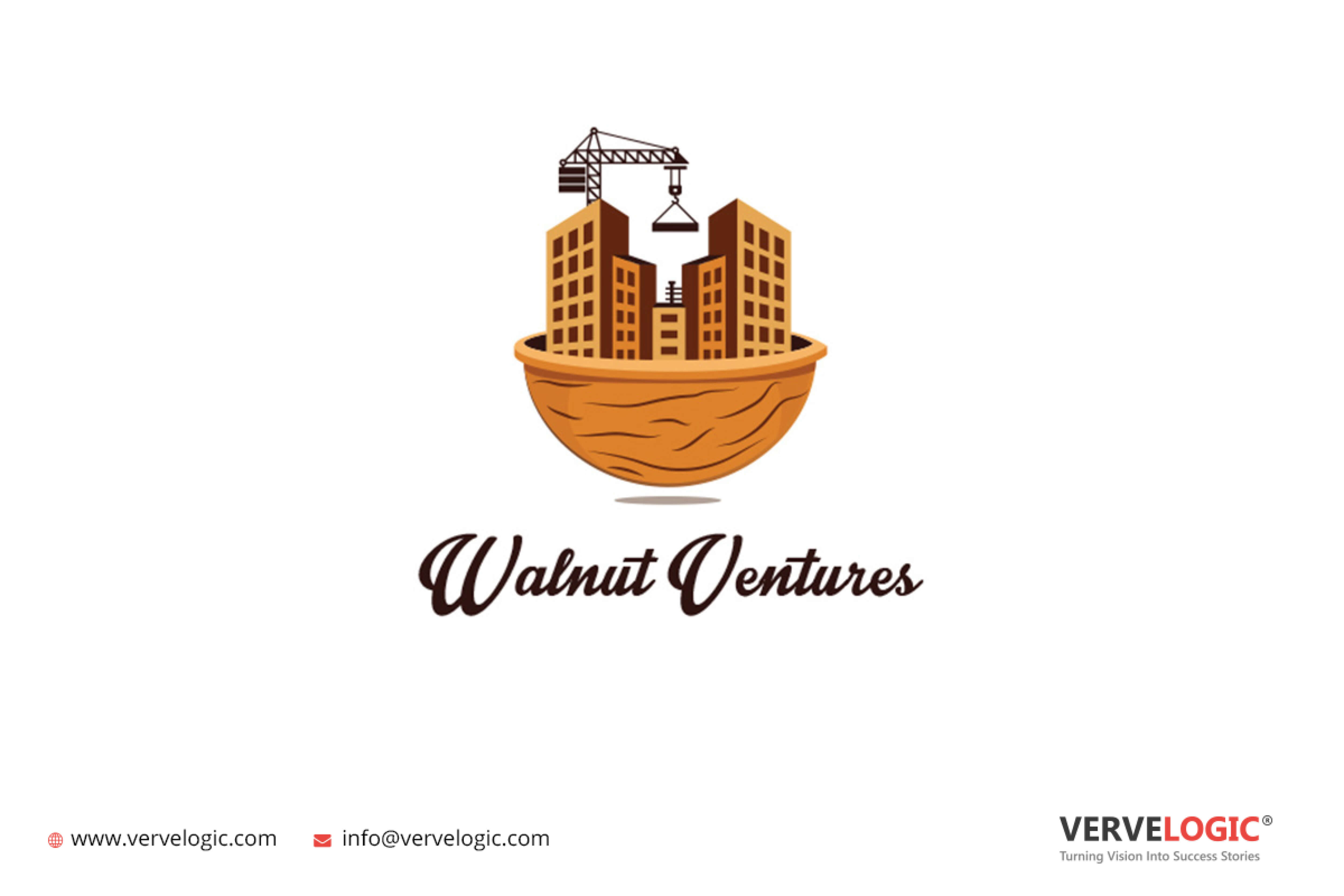
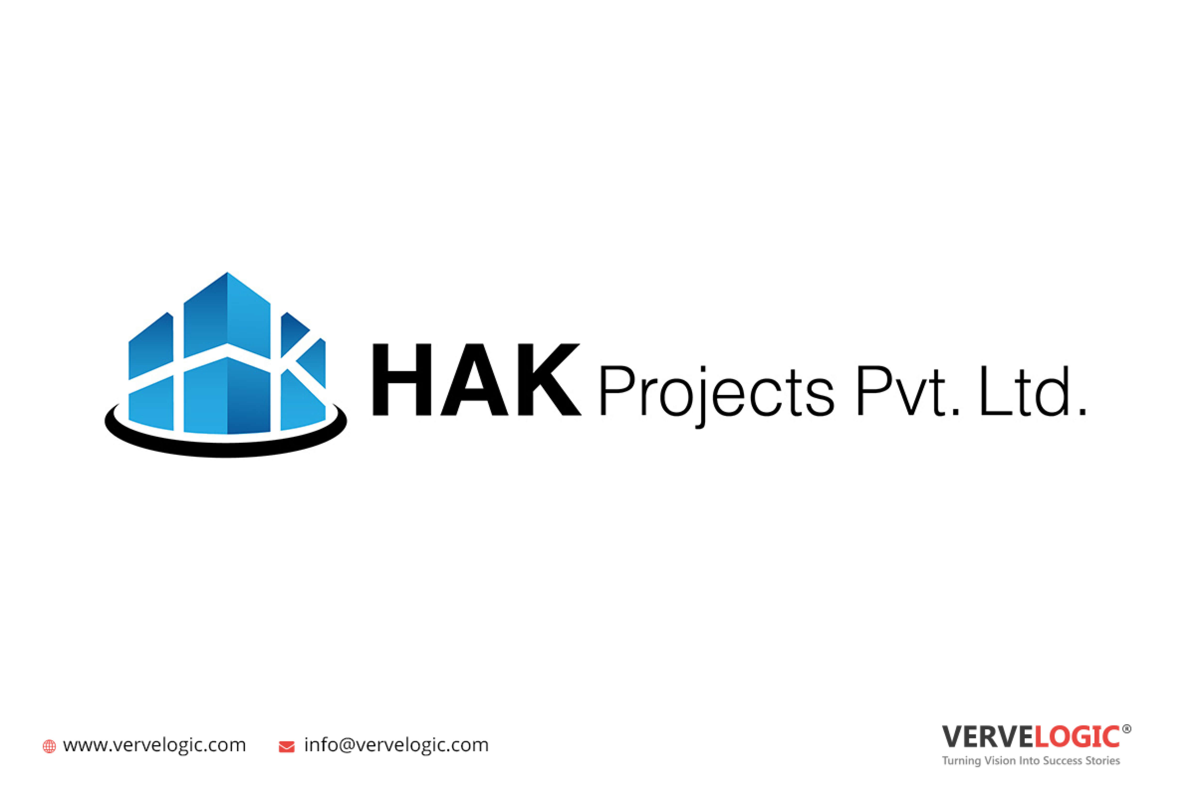
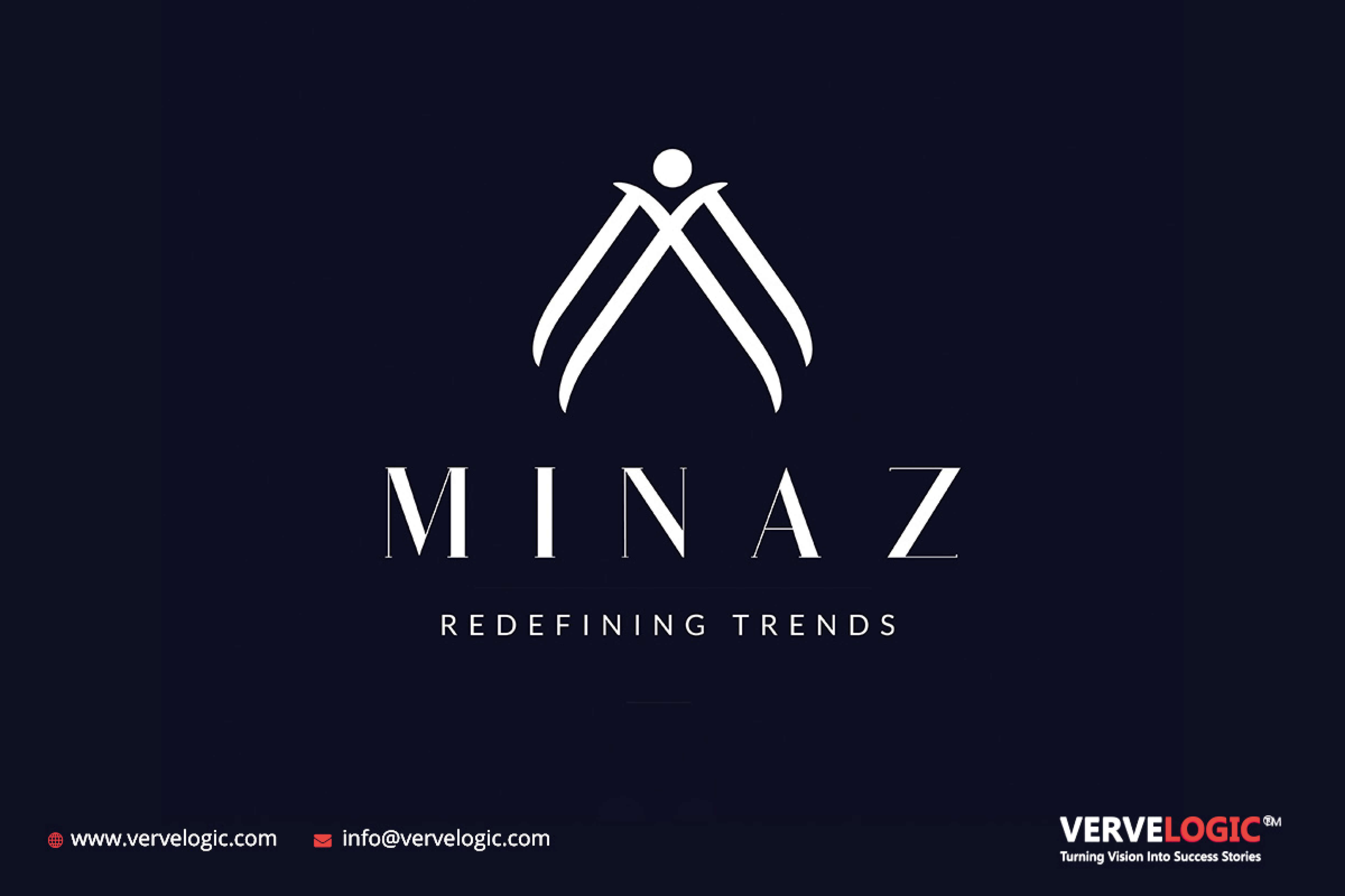
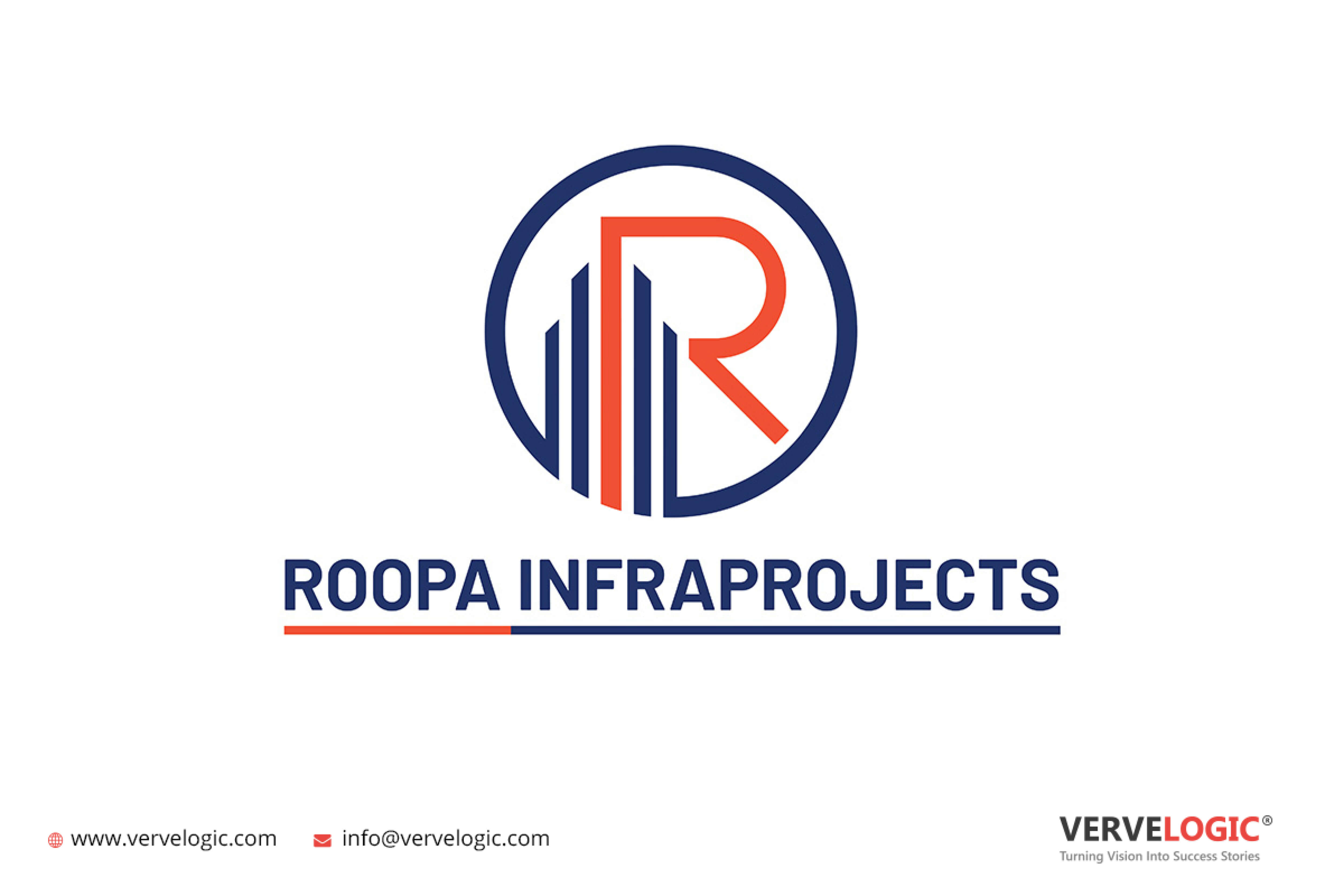
Top Construction Company Logos Designed by vervebranding
Being a top logo design company, BerveBranding has developed a number of world-class and effective construction company logos for businesses from all around the globe. Take a look at some of the best real-estate logos designed by our logo designers who are waiting to fulfill your needs through their skills and talent.
Without further ado, let us have a look at 10 of the best construction logos that we could find. But one thing is certain no matter how big or small the company, a logo from a professional logo design company can help you get the attention you always wanted.
1. Pyramid Builders

Pyramid Builders offer some of the most common yet effective elements in their construction company logo. As you can see they are using a pyramid which is a very popular shape in construction logos for two major reasons. First, it offers structural stability, and second, the triangle is a symbol of prosperity and success. Triangle is perfect for the big boost for construction brands. Moving ahead there are two vertical lines that are bisecting the triangle as they look like buildings inside the triangle. That is some ingenious thinking as this logo perfectly symbolizes their name. And that is the biggest advantage of this logo.
Apart from showcasing the pyramid, the triangle in the logo also serves the purpose of showing authority. The choice of using gold in the logo is another perfect placement as it features the connection to the ancient pyramids of its namesake. Pyramid Builders logo is the perfect example of how to use it to visually represent your name and how it can help with brand recognition.
2. Structure Innovation LTD.
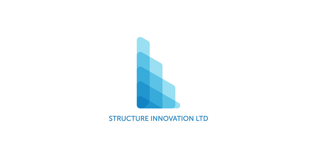
Structure Innovation LTD. logo’s the perfect representation of using modern trends and designs in a construction company’s logo. As you can see the use of colors indicates an advanced understanding of artistic principles, all the vertical blocks are used to denote the strength and stability that people usually look for in a construction company. Not only this, but those vertical blocks also look like buildings, and also indicated in what industry they are into the onlookers.
Once again the color choice is on point as blue is an excellent choice as they have used different hues and shades of blue in the logo. The color blue is used to represent trust and proficiency. As mentioned, they have used different shades where dark blue is used to represent the proficiency qualities of the company, and light blue stands for trust. Using different multiple shades, Structure Innovation LTD. got the best features of two different things.
3. Future Builders Construction
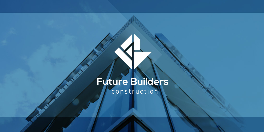
Let us have a look at another modern-style logo. Designed by the top logo design company for Future Builders showcases abstract imagery which is perfect and unique at the same time. As you can see it consists of various blocky shapes, arranged in a very aesthetically pleasing manner. It completely captures the essence of construction as all the shapes used in the logo have sharp points, embodying a fortitude and strength fitting the construction industry.
When modern audiences are looking for a contractor for their project, they are looking at a lot of logos along with their quotes and ideas. This logo of Future Builders Construction tells such people what they do and also that they can hammer your promise home. However, they have also added the word ‘construction’ in the logo which makes it super obvious. There’s nothing wrong with it as you need to make sure that people can tell in which line of the world you are in even if you have added an additional text.
4. Pulse Construction
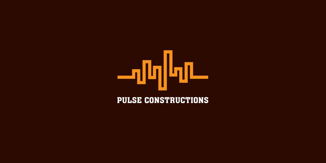
In some industries, there’s no wrong way to do something. But in construction, there is. And the next company on the list showcased it. They have ingeniously used their name i.e. pulse construction in their logo making, visual puns which makes it perfect for ideal brand recognition. Not only do they use the visual pun in their logo but it perfectly symbolizes their brand name. Anyone can definitely guess their company name just from the picture.
They have created a city skyline full of buildings that are perfect for the construction industry. And as per our experience, we have seen buildings with almost every logo on this list.
5. Top Pros Construction
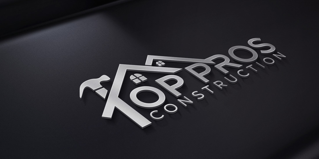
One of the best construction logos on the list or my personal favorite. Not only they have used the top of the house in the logo but also the hand tools which makes it very attractive to the audience. Top Pros Construction made sure that no one could doubt what industry they are in as they used house windows, hut shapes and the hammer is really amazing. It is visually appealing without much distraction.
Another imaginative thing in this logo is they merged the letters of the brand name with the actual image which unifies the whole picture. It makes you look at it again and again between the image and words. The logo and the company name complement each other in this aesthetically pleasing logo.
6. Stealth Construction
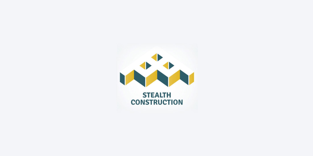
Stealth Construction is the first company in this list which is not use imagery of buildings in their logos but the other techniques used in the logos give in which industry they work in. The first thing is the use of isometric blocks which are quite edgy and rigid, very similar to the Future Builders logo. These blocks are perfect to show strength and stability.
The blocky shapes help construction companies to showcase their work as an open option in terms of design. In this logo, they modeled the logo by taking the influence of stealth bombers. It helps them represent their name to improve brand recognition, but the shape is also another triangle that shows prosperity and trust. The blocks at the top are almost invisible which is another visual pun to aid connotations with ‘stealth’.
7. ILM Architecture and Design

ILM has used a modern logo that is artistic and exquisite at the same time. It’s true you can’t think whether they are a construction company because of the shape and that’s why they had to spell out what they do in case the logo doesn’t get an immediate response or connection with the industry.
However, the design is very sophisticated and suggests that the construction firm stands for more upscale design. Take your styling ideas and make an attractive place that represents your personality. It’s a clever logo that can be the hyper-focused laser to use and let the prospective clients know, “I am here and I’ve got the skills to handle your super-specific project.”
8. Ram Construction and Services
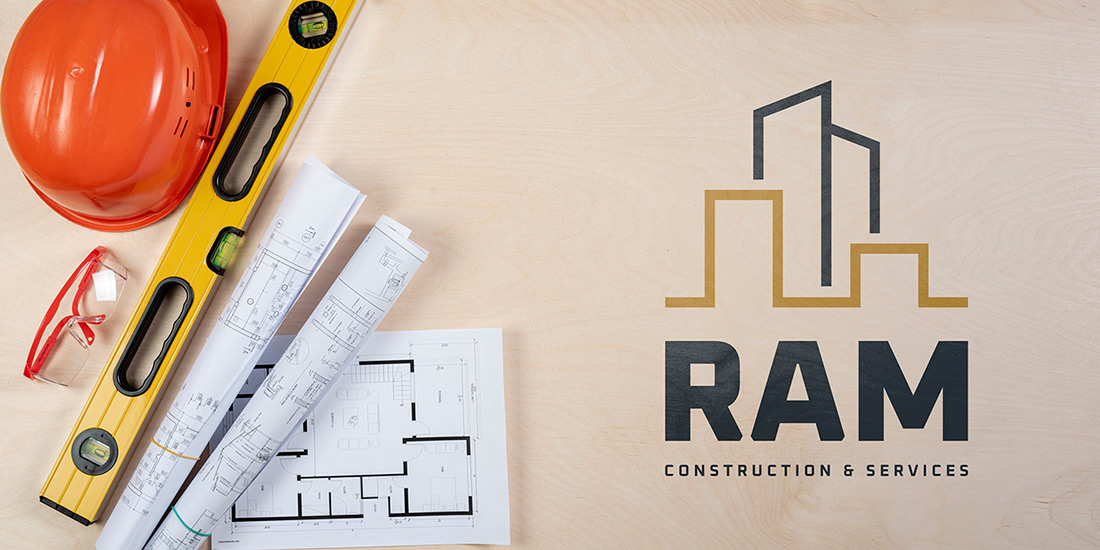
The next logo in the list can be described as a simple and stylish logo that has the right parts in all the right places. Ram Construction and Services have used minimalist building designs which are straight lines and nothing more, but they are beautifully orchestrated making it perfectly clear what they’re supposed to be. Moreover, the long vertical line placed in the center emphasizes the elements like power and authority. The elements that define a construction company. They have also used two different colors to make the logo visually appealing. The use of a single color in this logo would make it less interesting and appealing. Two different colors are used to create abstract lines to distinguish between different buildings.
9. THI Builders
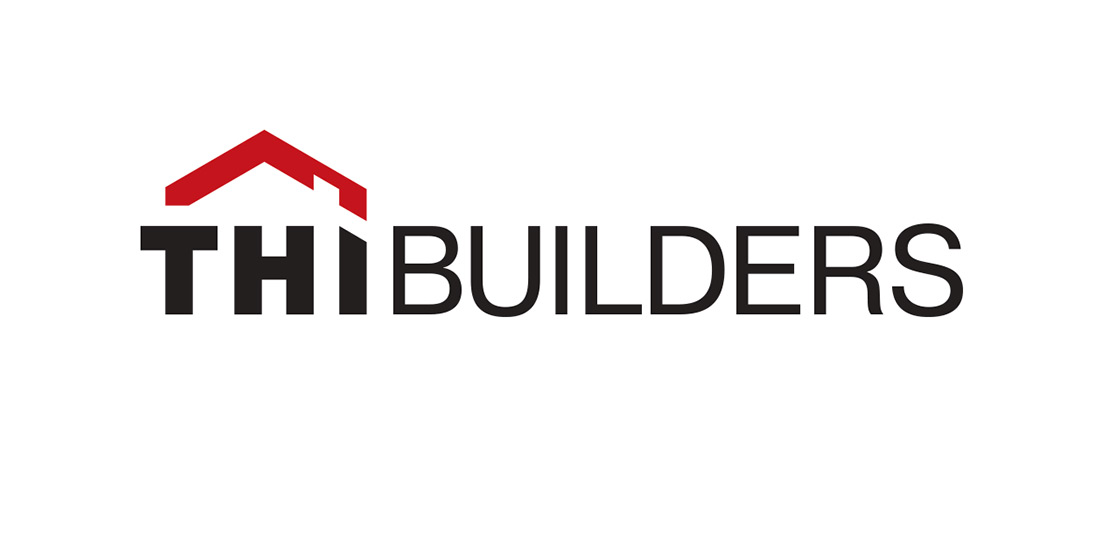
Unlike other construction companies, THI Builders opt for a traditional look rather than a modern and artistic look. The logo is basically their name, with some added spice to it. First of all, their name is pretty unique and consists of THII at the start and they used the same element to show the audience that they are a construction company. The arrow-like roof offers the elements like power and authority connotations as an upward-facing triangle.
The best part is they opt for maximum minimalism so it doesn’t look boring at all. When it comes to color choices then use a boiled red to complement the black, for the poignant visuals. The use of negative space to carve out a “Chimney” also adds a dynamic flair to this construction company’s logo. You might have also noticed that THI has bolder typography and is also paired with the red roof which makes it stand out from the rest in the industry.
10. Draco
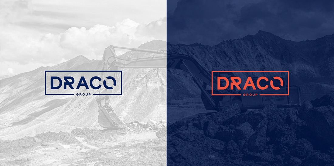
Let us have a look at the last logo in our list which showcases the construction company known as Draco. They are using a framed logo that unifies the elements and keeps all the attention at the central focal point which is the company’s name. They have also used a straight-edged rectangular frame to make your brand appear capable of handling any kind of project and strong in the industry.
The logo design company has played with the visuals on the letters so it doesn’t look boring to the viewers. This helps in brand recognition but also can be used to communicate further options. But this logo somewhat doesn’t serve its purposes as it is not able to clarify what industry it is in. Without symbolic imagery or extra text then the Draco group can be anything from a law firm to a group of different companies.
Top Tips For Designing a Construction Logo
As we witnessed the 10 best construction company logos now as the best logo design company let us also share some tips for designing a construction logo to make your looks indistinguishable from professionally designed logos.
Squares and Triangles
Remember when we said that there is a way of doing construction logos then we were talking about a few elements that complete a logo for a construction business. Adding squares and triangles are structurally sound shapes that help in representing fortitude, stability, and other essential traits for a building company. It is the only reason why most businesses use upward-facing triangles in their logos. They also make it easy to establish well-made buildings but also these shapes incidentally have connotations of strength, power, and competency – so people will associate your construction firm with secure buildings. That’s even logo designers avoid using circles while designing construction logos. Circles are fun for casual brands but for serious brands like construction companies, people always prefer striking logos over fun.
Vertical Lines
Apart from squares and triangles, vertical lines can be used in the construction company logos as it gives a feeling of rising to the top. It’s like the definition of success when the eyes move up. We see them like growth on a graph. The use of vertical lines is also better because they are associated with the vertical lines – power, success, and prosperity which fits construction like a glove. And with all the buildings it becomes easy to use vertical lines in the logo as the experts from the logo design company also believe so.
House and Buildings
You need to make your logo super obvious because your audience wants to see it. That’s what images of houses and buildings are in construction logos. It’s not a trend but rather a fast and efficient way to communicate with your audience and make them understand what you stand for. A cheat code we can say for all the construction companies.
A smart way to use them in a unique way, a way in which no one has ever used them before. Using an original or artistic depiction of a house, building, or skyline will effectively distance your brand from the others.
How to Make a Construction Logo?
We hope you got the idea of creating an effective construction logo but you must also know how to make one. Here you have two options, the first one is to hire a logo designer and share the details to get an amazing logo for your construction business. And the second option is to redesign for yourself.
Well, hiring a professional designer is a better idea because they have loads of tips and tricks in their books and they can get an effective logo for your business in no time. However, you must also remember that no skilled designer works for free but it will be worth spending every single penny on the logo.
Endnotes
This is everything about the 10 best construction logos and how to make your own logo for your business. If your business is from another industry then we highly recommend our insights on our Brands of the World – The World’s Most Recognizable Logos. It will help you understand how top companies from all over the world use different kinds of logos, and the hidden meaning of their logos, and take inspiration from these best logos for your own business. We hope you like this blog as we will be back with more.
You may be a construction company and you may be planning to build many buildings. But you need to build your business image first before building something else. We can help you build your business image. We have branding and logo designing services that will help you to have the best services. You can connect with us to have the services you are looking to have for your business.
VerveBranding can be your one-stop solution for branding and designing because we have decades of market experience and a team of experts who, over the years, have worked on many major and minor projects for all types of industries. We provide designing and branding services at the most affordable price. For services related to mobile app development or web development and online marketing services, check out our subsidiaries, VerveLogic and VerveOnlineMarketing.