Top 30 Best FREE Sans Serif Fonts of 2023
Top 30+ Best FREE Sans Serif Fonts of 2023
In this world of content technology, popular sans-serif fonts are favorites amongst everyone.
In this article, we are discussing the most exceptional, rare, and best free sans serif fonts, to resonate and define industry business goals in 2023.
As per the market, the demand for Global Font and Typeface is progressively increasing by 3.24% to reach the share of $1.21B by 2028.
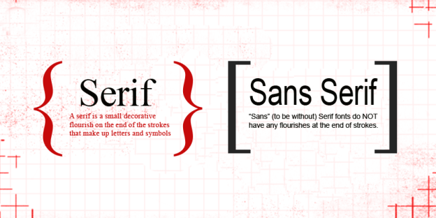
This write-up is a collection of some of the most extraordinary serif and sans serif fonts for Logo design.
So, stay connected and read onwards.
Typography is very hectic, but to help you with this tedious job, we are enlisting here the best sans-serif fonts. The font has the following qualities:
- The sharp font’s cutting-edge design gives a selective appearance to the texts.
- Font face type is the most important factor that gives freedom to your texts.
- You should believe in the content theme if you want to display it exclusively.
How to Pick out a Font with Purpose?
Many people who require to show the different appearances of their texts. Or the organization’s professional designers want to involve a typeface list until they discover the one with which they can get along in the whole project.
So, the main intent of this write-up is to predict those factors. These factors can also enrich your writing style as well as help you to improvise your writing presentation.
Let’s check out > Top 10 Best Completely FREE Calligraphy Fonts 2023
Reason to Choose Best Sans Serif fonts
Why use Sans-Serif?
Sans Serif fonts are the best choice for you; if you want to impress your audience through your font type and design.
Always keep in mind that your font should hold a few significant attributes. Like:
- It should always show a manner of speaking.
- Easily convey your choice.
To clarify the selection process, there are four properties you need to consider while choosing Sans Serif fonts.
- It should be specific and persistent.
- The font face type should be readable.
- Well-readable on every online platform.
- Should easily pass on your intent of choice
Also check: 11 Types of Logos, How & When to Use Them (Ultimate Guide 2023)
Top 15 Best Sans Serif fonts for Designers 2022-23
1. Anton
Anton sans serif typeface designed by Vernon Adams. It supports the web font after digital conversion & reshaping of the letter fonts. The font type even appears as a bold font in modern web browsers.
The size of the font is available from 8 pixels to 300 pixels. Anton font type supports the overall inclusion of Western, Central, and South-Eastern European languages.
Read More: 61 Best Logo Fonts and Which One Is Right for You
2. Abel
Abel is a contemporary version of the shortened flat-sided sans serif designed by MADType. In the beginning, this font type was applied to the headlines of the newspapers and posters. This style works well in smaller sizes and is available in only a single variation.
3. Alegreya Sans
Alegreya Sans is a font under the sans serif family designed by Juan Pablo del Peral. The font works well for a calligraphic writing style that expresses an impulsive and multifaceted tone. Further, reading long texts renders a pleasing impression to scholars.
In the beginning, this font type aimed at portions of literature writing. The italics style provides a Roman touch to the font. This font style is available in multiple size variants like Thin, Light, Normal, Medium, Bold, Extra Bold, and Black.
4. Barlow Condensed
Barlow Condensed is a somewhat circular, low-contrast group of font types designed by Jeremy Tribby. This font-type family provides support for Roman and Italic. The font type supports different sizes like Thin, Extra Light, Light, Normal, Medium, Semi Bold, Bold, Extra Bold, and Black.
Read More: 11 Types of Logos, How & When to Use Them
5. Barlow Semi-Condensed
Barlow, designed by Jeremy Tribby. The font type is somewhat circular, and light-contrast in shape & color. The semi-Condensed family is part of the contracted family along with Roman and Italic styles.
6. Cabin
The cabin is a school of thought inspired by a touch of modernness, designed by Impallari Type, Rodrigo Fuenzalida. Cabin font integrates stylish dimensions and visual modifications. It has a font type with a conventional side, creating its personality.
Cabin supports a wide language including all Western, Central, and South/Eastern European languages. The font type is available in different sizes like Normal, Medium, Semibold, and Bold.
7. DM Sans
DM Sans is a sans serif design, specified for smaller text sizes designed by Colophon Foundry, Jonny Pinhorn, and Indian Type Foundry.
The DM Sans project was rolled out by Google to give customized typefaces for analog and digital media. The font type is available in different sizes like Normal, Medium, and Bold.
Read More: How To Make A Logo For Your Business [Step-by-Step Guide]
8. Gudea
Gudea, designed by Agustina Mingote. It is a legible, broad, and operational typeface family, with an unsophisticated and altered structure. The font type is best suited for the engineering textual matter and matches well for engineering, land surveying, and architecture fields. It is one of the popular sans-serif fonts.
9. Gothic A1
Gothic A1 is an Asiatic and Italic nomenclature typeface that is a variable sans-serif typeface. The font type is available in different sizes like Thin, Extra Light, Light, Normal, Medium, Semi Bold, Bold, Extra Bold, and Black.
10. Harmattan
Harmattan font renders an easy performance of the Arabic language writing system. The font is available only in uniform style only. It owns a very sharp, cutting-edge font-type feature.
11. Hind Guntur
Hind Guntur is a group of fonts, which include the Hind Multi-Script and Latin-script characters. The font was purposely rolled out for usage in User Interface design.
This type of font has letter forms of human style, which are similar to single-line linear strokes. It is available in multiple sizes Light, Normal, Medium, SemiBold, and Bold.
12. Poppins
Poppins is one of the new typefaces to join the sans serif typefaces family. The typeface assists with the Devanagari and Latin writing styles. It is the first Devanagari typeface font which is similar to the Latin style and purely based on geometry, in particular circles.
Devanagari is designed by Ninad Kale and the Latin is by Jonny Pinhorn. The font type serves multiple sizes like Thin, Extra Light, Light, Normal, Medium, Semi Bold, Bold, Extra Bold, and Black.
Read More: Powerful Tips for Effective Logo Design
13. Quicksand
Quicksand is a type font under sans serif with round-shaped poles. It offers display uses and mainly focuses to apply in small sizes. The type font was designed by Andrew Paglinawan and further improving the quality released various Light, Normal, Medium, Semi Bold, and Bold.
14. Roboto
Roboto operates has a twofold quality, designed by Christian Robertson. The font type is based on large geometric shapes and machinelike frames. Further, the font has attributes of cordial and open curved shape lines.
The type font supports the letters with natural width. This provides a more natural reading time interval to the type font. It is one of the best free sans-serif fonts, and also offers multiple sizes such as Thin, Light, Normal, Medium, Bold, and Black.
15. Space Grotesk
Space Grotesk is a variant in the group of sans-serif typefaces designed by Florian Karsten in 2018. It is released to serve better readability while modifying all the non-display properties.
The typeface permits Western, Central, and South-Eastern European nomenclature assistance, as well as available in different varied sizes like Light, Normal, Medium, SemiBold, and Bold.
Read More: What Is Typography? Why Is It Important For Graphic Designers?
16. Source Sans Pro
Source Sans Pro, is the first open-source typeface family launched by Adobe, designed by Paul D. Hunt. It relates to the group of a sans serif typeface meant to work in sync with user interface programs. The font type offers Extra Light, Light, Normal, Semi Bold, Bold, and Black sizes.
What are the Best Sans Serif fonts of 2022-23?
17. Amiri
Amiri is a standard Arabic language font, designed by Kaled Hosny. This font style is applied in printing books and new continual textual matter. The typeface offers a unique single design, hence standing out from the list of the different free sans serif fonts.
18. Arvo
Arvo is a geometrical-shaped slab-serif typeface family, designed by Anton Koovit. This font type is well-matched for screen and print. The font is a mixture of different styles Roman, Italic, Roman Bold, and Bold Italic.
In December 2013, a newer version of Arvo 2.0.1 was released. This font type was intentionally issued to improvise smaller font sizes. Further, in new updates, Bold and Bold Italic styles include allowing written material grouping.
19. Bitter
Bitter, a font type designed by Huerta Tipográfica, is a member of the serif fonts family.
In this era of digitization, individuals make maximum use of the screen to read every day. They are habitual in using screens as compared to printed documents or textual matter pages.
With the intensifying quality and increasing demand for electronic type books, type font creators are functioning hard to fetch the best match which works well for the screen while reading.
Bitter has an alteration in stroke size width and is different from the Regular style. This modification brings forth an aggravated color in the piece of writing, supported by the deep strokes with square ends.
Or you can check our color theory fundamentals for more.
The typeface includes an extraordinary feature of balanced and manually spaced font adjustment. This feature makes it a popular sans-serif font, as most web browsers do not presently support this specific feature.
20. Caudex
Caudex, designed by Nidud, was originally produced in the late 90s for publishing some old handwritten textual matter. It considers some Medieval Unicode Font Initiative (MUFI) version 3.0 testimonials.
21. Cormorant
Cormorant, designed by Christian Thalmann, is an autonomous exhibit kind of type font family. The exclusive attribute of this font is that most existed designed from scratch. It offers multiple sizes Light, Regular, Medium, semi-bold, and Bold.
Read More: 8 Points To Remember When You Are All Set To Design Your Company’s Logo
22. Crimson Pro
Crimson Pro belongs to the Serif font style family, designed by Jacques Le Bailly. The typeface offers multiple varieties depending on their use. For example, they serve as definitive and intense typeface or school textbook data, for the long article internet site and any of the text material of the book-length size.
Further, many modifications were added to create the type of font that fits the best with the long article and improved readability.
23. EB Garamond
EB Garamond was designed by Georg Duffner. The typeface is intended to serve a human writing style tone. This serves as the best replica of the original writing manner. The typeface is a fundamental point and probably the best typography.
24. Inknut Antiqua
Inknut Antiqua is a typeface for a piece of writing and book-length text material. While web-publishing the data as a contemporary print media, it is designed to render the best legibility to the data.
25. Libre Baskerville
Libre Baskerville is a font designed for web publishing and purposely modified for body text. The font type was developed by the Impallari Type. It has a full-length height, broader counters, and inferior contrast, that functions flawlessly while seeing on-screen.
26. Playfair Display
Playfair Display is a transformational design, developed by Claus Eggers Sørensen. Further, with improvements in the printing process, printing ink, and material the textual matter of dark contrast and refined boundaries were employed.
In November 2017, an update was rolled out, in which many precise improvements and extra language assistance were included.
27. PT Serif
PT Serif was designed to serve the Russian people to learn in their native language. It is developed by Designed by Alexandra Korolkova, Olga Umpeleva, and Vladimir Yefimov.
The font face is a matchless and important tool in this digital world as it includes western, and central languages as well as adds every title language in Russian Federation.
The font is perfectly harmonic with metric function, dimensions, physical property, and design. It supports multiple styles like regular and bold italics etc.
28. Quattrocento
The Quattrocento, designed by Impallari Type. It is an Italian typeface that is a Classical, High-class, Sober, and Intense typeface. Their broad and exposed letter type, and the large height, create it very readable for body textual matter at tiny sizes and vice-versa.
29. Roboto slab
Roboto owns a duality in nature, designed by Christian Robertson. It is based on the machinelike skeletal frame, and the word form is mostly geometrical. Similarly, the font face type consists of a gracious appearance with exposed curves.
Read More: 5 Reasons Why A Perfect Logo Is Important For Your Small Business?
30. Source Serif
Source Serif designed by Frank Grießhammer. It is the font style of the classical type, which is developed by a close fit of textual matter dimensions and type ink color. Mainly projected for online digital surroundings, the font letter shapes are easy and extremely legible. The typeface possesses an intense attribute of its own that will reflect when applied to stretched textual matter on the screen.
31. Spectral
Spectral is a fresh and varied serif face type, designed by Production Type. The font is accessible in multiple variants of roman and italics. It renders an efficient, exquisite design that is meant mainly for textual matter, screen-fit surroundings, and long book-length text.
Final Words:
We have enlisted several untold attractive Sans Serif and Serif fonts that you can apply. All the above-mentioned fonts are available free of cost.
You need to be choosy while selecting the popular sans serif font style or your typography. The best sans serif fonts and face type will improve the text value as well as it will enrich the readability of the text on the different online platforms.
VerveLogic can be your one-stop solution for mobile app development and web development because we have a team of experts and market experience. You can get your app or website developed at the best price possible. Also, if you are looking for branding solutions or online marketing for your brand then you should check out VerveBranding and Verve Online Marketing today and make your brand stand out. We hope we have solved your every query regarding the app icon and how to create an amazing app icon. Let us know in the comments and questions.
Do not hesitate to leave feedback, on which font style worked well for you.