11 Types of Logos, How & When to Use Them (Ultimate Guide 2023)
Choose the best logo type for your brand from the following list of the 11 most used logotypes.
Are you looking for the best logo designs? Which are some of the most famous logo designs? What do logo design experts say about logo desire and the principles of logo design? Should you hire a logo design company for your company logo design? If you are looking for inspiration to design a logo for your company. We can help you with the best logo designs. Here we have added the top companies’ logos that will help you with the best designs for your company. All the companies added here will be the best inspiration for you to design an impactful logo for your company. Read here to know all the main things to have an impactful logo.
Every business, be it small or big, local or global, needs a face. And a logo fulfills this need of the brands. This is why we see logos literally everywhere and on every single product around. So far brands have understood the importance of logos, however, they still face dilemmas when it comes to choosing a suitable company logo design.
While choosing a font or shape falls secondary, determining the type of logo is the foremost thing a business needs to think about while designing a logo. Hence knowledge about the different logo types should be your number one priority. So, making it convenient for you we have compiled the 11 different kinds of logos. Jump to the following section to know about them.
Top 11 Different Types Of Logos, What’s best
The following list consists of the different types of logos and their names, how and when to use them, and their pros and cons. Each type has been described in detail for your convenience. Know when and how to use these logos, and also learn about their advantages and disadvantages, before you make a choice for your brand. Read on.
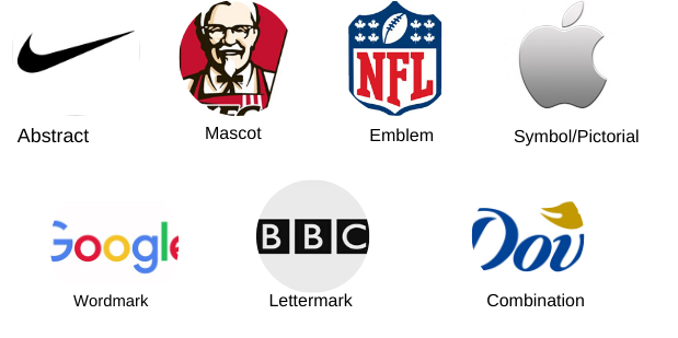
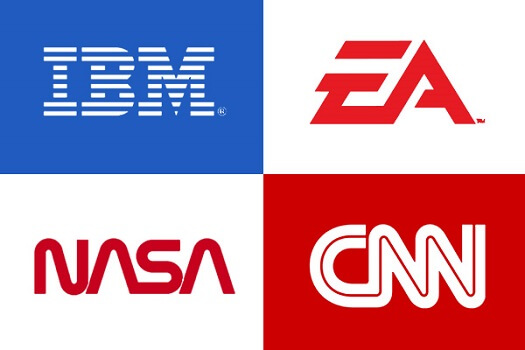
1. Lettermark or Monogram
Lettermark logos are easy to create typography-based logos. They consist of only abbreviated forms or initials of brand names and no images. This makes it easy to identify and remember. Many globally recognized companies with longer names have opted for monogram logos. Examples are IBM, CNN, HP, LG, etc.
A. When To Use Lettermark Logos
Brands with names longer than usual must opt for these types of logos. If you are a new brand, then prefer adding the complete brand name below the logo, so people can know who you are.
B. How To Use Lettermark Logos
- Keep It Simple
Maintain the simplicity of the logo and avoid incorporating complex details. - Provide Your Company Name
If you are a new business, provide your company’s full name below the logo. This will help people recognize your brand via marketing materials, websites, etc. - Use a Customised and Legible Font
Use a customized font if you want a distinctive logo from competitors. In contrast, you can also choose a ready-to-use font that best suits your brand image. Whatever font you choose, remember that the brand initials are the pivot. Hence, it is best to choose a simple and legible font for them.
C. Pros
- Lettermark logos work best for brands with long names, as they turn the lengthy name into a recognizable form.
D. Cons
- New brands using monogram logos without their company’s full name below may confuse people about their identity
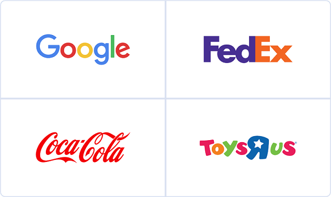
2. Wordmark or Logotype
Wordmarks are also typography-based logos. However, this type of logo is composed of the complete brand name set in a specific typeface. Logotypes do not contain images, symbols, or emblems at all. Examples are Facebook, Canon, Samsung, Sony, Google, Microsoft, etc.
A. When To Use Wordmark Logos
Brands with a simple, enticing, and distinctive name can use wordmark logos. Since the focus will be the brand name, choose a font that is memorable and resonates with the brand’s persona. For example, use a stylish font for a fashion brand.
B. How To Use Wordmark Logos
- Pick A Suitable Typeface
Since wordmarks are entirely typographic, the impact of the logo largely depends on the typeface. Hence consider the brand’s message and character carefully before choosing the font. - Pick A Suitable Color
Just like the font, choose a color that compliments the brand personality. Since the logo is a complete name, prefer painting it with a single meaningful color. - Add Interest
These types of logo designs can look monotonous at times. Hence to add interest, you can customize or change the font of one letter in the logo.
C. Pros
- Wordmark logos are the best choice for new businesses, looking for speedy recognition.
- They are easy to understand as they clearly mention the brand name.
- Legibly scalable on different marketing materials.
- Can be combined with other elements to form combination logos.
D. Cons
- They do not work well for brands with lengthy names.
- Brand names set simply in a font alone may not catch the audience’s attention. Hence, requires professional assistance.
- You may need to change the typeface in the future to avoid outdated design trends.
Read About: Typography and why is it important for Graphic Designers.
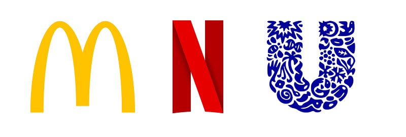
3. Letterforms
A letterform logo is a more simplistic form of a letter mark. It consists of only a single letter, set in a bold and impactful typeface. Examples are WordPress, Netflix, McDonald’s, etc.
A. When To Use Letterform Logos
Use letterforms to simplify lengthy and complex brand names. Sometimes lengthy brand names are hard to remember, hence a letter logo will make it easy.
B. How To Use Letterform Logos
- Use An Effective & Readable Typeface
Since it’s a single-letter logo, choose a typeface that is unique, impactful, and easy to read from a distance. Otherwise, the audience will find it worthless to look at. - Create a Memorable Design
Do not forget that people should also be able to memorize it besides finding it unique. To create a memorable and catchy design, customize elements (backgrounds, colors, fonts).
C. Pros
- These are simple yet effective enough to create a company name in mind.
- Easily scalable on different marketing materials.
- Can be made interesting using different backgrounds, typefaces, colors, etc.
D. Cons
- Since a letterform logo is a one-letter logo, it gets challenging to determine the design at times.
- The logo may fail to capture attention if it’s not unique.
4. Pictorial Marks or Logo Symbols
Pictorial logos are icon-based logos and are the most popular among all. These logos symbolize the brand name through an easily recognizable character. Examples are Apple, Twitter, etc.
A. When To Use Pictorial Mark Logo?
This type of logo is a useful choice for brands that specialize in a product/service that they can represent by an icon. Also, if your brand name is any real-life object, then you can refer to that object to create your logo.
B. How To Use Pictorial Mark Logos?
- Pick The Right Icon
Choosing the right icon should be your primary objective. Make sure it is accurate to represent your brand. Ask questions, if you want a logo symbolizing your name. Should your logo convey a deep meaning? Are you trying to invoke any emotions through it? Once you find the answers, picking the right icon will get easy. Besides, take inspiration from real-life objects, if your brand or product revolves around them. You may also refer to the logo design stories of famous brands using pictorial marks. - Incorporate Your Company Name
If you are a newbie in the market, you must incorporate your name below the icon. This will allow viewers to know who you are and what you actually do. - Go For Symbols That Last
Avoid choosing trendy symbols for your logo as they will get outdated in a short period. Instead, select icons that offer timelessness and create a meaningful impact on the viewer.
C. Pros
- Pictorial logos are simple-looking, clean, and easy to grasp.
- They allow you to convey your brand message through just an image.
- These are easy to scale as per the different sizes of the marketing materials.
- Once you are recognized, you can use the picture alone to represent the brand.
D. Cons
- At times, it gets difficult to choose the perfect image that best describes the brand.
- If a brand’s pictorial logo is separated from a wordmark, then it may be hard to recognize it.
- If you are a new brand, it is not a good idea to opt for a pictorial logo. This is because you may not have a strong audience base yet who recognize you through your logo.
![]()
Read More: 5 Reasons Why A Perfect Logo Is Important For Your Small Business
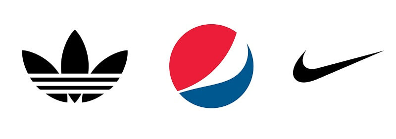
5. Abstract
Abstract logos are also icon-based logos, however, they do not have a literal indication. These are conceptual geometric forms, custom-made to represent an idea rather than a direct message. This type of logos is sometimes inspired by real-life objects and developed in a non-realistic form. Examples are Nike, Airbnb, Adidas, etc.
A. When To Use Abstract Logos
Brands that work in multiple divisions, or are service-based, or technology-based can use a well-planned abstract logo. Global businesses whose labels are not understandable in different languages can also use them.
B. How To Use Abstract Logos
- Know Your Brand Values
Understand your brand values and search for geometrical forms that resonate with them. If your shapes do not evoke brand values, your logo will be pointless for the audience. - Focus On The Detail
The details of an abstract logo should be clear in order to convey a clear message. Hence, make sure that your logo does not create a shape, vague enough for viewers to understand and remember. - Consider The Printing Aspect
Pay attention to the printing of the logo when it comes to branding. Logos with complex details are difficult to print, cost high, and give an unprofessional appearance when scaled. You may consult a professional logo design company to avoid blunders like this.
C. Pros
- Abstract logos are one-of-a-kind that help you stand out from the competitors.
- There are fewer chances of getting an abstract logo copied by others.
D. Cons
- Unlike other different types of logos design, abstract logos can easily confuse the viewer.
- New brands may find it difficult to convey their values if they use an abstract logo solely.
- Since there is a lot of scope for experimentation, the brand’s design objectives may get distracted.
6. Combination Mark
As the name suggests, a combination mark logo is a combination of different types of logos. Her words and pictures are used together to create a unique design. Examples are Pizza Hut, Dove, Puma, Burger King, etc.
A. When To Use Combination Mark
New businesses can opt for combination logos, as they contain both symbols and company names. Also, brands finding it difficult to choose a specific type of logo can go with combinations among all types of logos. It is even a good choice for those who think that the symbol in their logo needs accompanying words to clarify the idea.
B. How To Use Combination Mark
- Choose The Right Icon/Image
Choose a symbol that honestly represents the brand’s value and conveys its message. Also, you may want to use the symbol solely afterward, hence make sure that it is complete in itself. - Determine The Size Of The Icon & Text
Make certain that the symbol and the text accompanying it are not too large or small in size. Also, ensure that all the elements are central. - Proper Placement Of Elements
The placement of text and symbols either side-to-side, top and bottom, or integrated, should be done appropriately. - Proper Spacing Between Elements
The space between the symbol and the company name should be balanced. Elements with too much or too little gap give an unprofessional look.
C. Pros
- Combination logos are versatile.
- They work best for new businesses that want to build a quick identity.
- Brands using combinations can easily trademark their logo.
- Established brands can enjoy the benefit of using logo symbols solely, without the brand name.
D. Cons
- These logos are not suitable for brands seeking minimalist designs.
Also, know about the Best Logo Fonts and Which One Is Right for Your Brand.
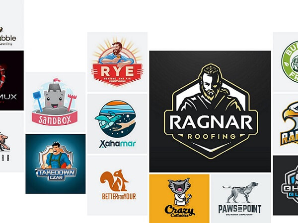
7. Mascot
Mascot logos consist of illustrations of fun and cartoonish characters representing brands uniquely. These types of logos work as brand spokespersons or ambassadors trying to engage the audience. Sports, food, service companies, etc. majorly use mascot logos. Famous examples are KFC, Pringles, Planter’s Mr. Peanut, etc.
A. When To Use Mascot Logos
Businesses use mascot logos with the objective of familiarizing the audience. Hence if you are a food brand, cafe, shopping brand, service company, or business catering to children’s food or clothing, mascots are a great deal.
B. How To Use Mascot Logos
- Choose An Apt Character
The major attraction of mascot logos is the cartoonish character inviting the audience. Hence this character should be designed carefully. Consider the objective and the target audience of your brand and then create one that can deliver the brand’s message. - Make It Scalable
Mascot logos contain a lot of details and, hence must be scalable to meet the branding material needs. Even if the logo is reduced to the size of business cards, each detail must be legible. Similarly, when put on large billboards, its resolution should not be disturbed.
C. Pros
- Such kinds of logos create a positive and friendly atmosphere around the brand and among the audience.
- They attract a large audience to the brand.
- Can be used to deliver different expressions, based on the brand’s message.
D. Cons
- The use of inappropriate mascots results in misleading brand objectives.
- Brands wanting to send a serious message could not use mascot logos.
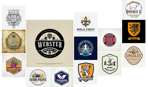
8. Emblem
Emblem logos are like combination logos, but with a traditional touch. They contain text within icons like seals, badges, and crests. Among all types of logos, they are quite detailed in profile. Popular examples are Harley Davidson, Starbucks, BMW, etc.
A. When To Use Emblem Logos
Usually, brands that want to convey a reputed persona and their traditional values to the audience, opt for emblems. Therefore, most government agencies, schools, large organizations, automobile companies, food and beverage companies, etc. choose these logos.
B. How To Use Emblem Logos
- Make Sure it is Scalable
Make sure your intricate logo is scalable when put on the marketing materials. Check its legibility and appearance on sizes as small as a business card and as big as a billboard. - Be Convinced About the Design
Emblem logos are less flexible than combination logos. Hence before you finalize the logo, make sure that it is apt, complete, and requires no need to be redesigned any sooner.
C. Pros
- With Emblems, the chances of getting logos copied by other brands are almost zero.
- They are impactful and create a lasting image in the viewer’s mind.
D. Cons
- This type of logo is less versatile than other types.
- Since they are much more detailed, they are difficult to scale on marketing materials with smaller sizes.
Also Read: Pros And Cons: Is It Good Or Bad To Use Online Logo Generator For Creating Business Logo
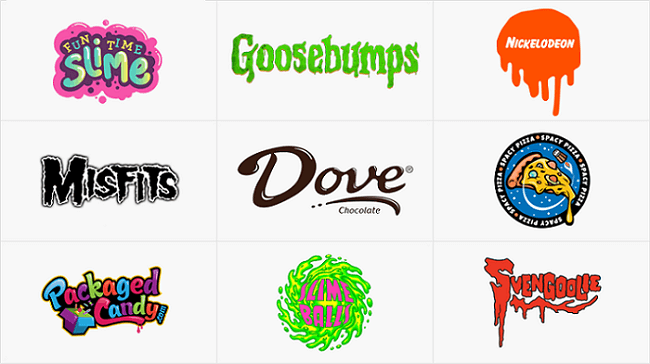
9. Slime
Slime logos are contemporary logos with a cartoonish approach. They are inspired by a slime splash and do not consist of a particular font or icon. These logos are entirely custom-made to the requirements of the company or the industry to which they belong. The Nickelodeon logo is among the most popular examples of slime logos.
A. When To Use Slime Logos
Brands offering children’s products or services that are intended to be lively can use this type of logo.
B. How To Use Slime Logos
- Understand Your Brand Message
Before you finalize this type, make sure it is the best to represent your brand. Businesses with more serious or professional approaches cannot use this type of logo. - Opt For A Suitable Character
Generally, brands with kids as customers use slime logos. Hence, if you are one of them, choose a character that is lively, friendly, and engaging for the kids. - Use Slime-Inspired Details
With slime logos, no font or icon is standard. Hence, search for details and elements that can be uniquely implemented in a slime logo and make it memorable.
C. Pros
- These logos are attractive and engage customers quickly.
- They give a distinct identity to brands with a funky approach.
D. Cons
- Not the right option for brands with serious objectives.
Also, read about inspiring cloud-based logos.
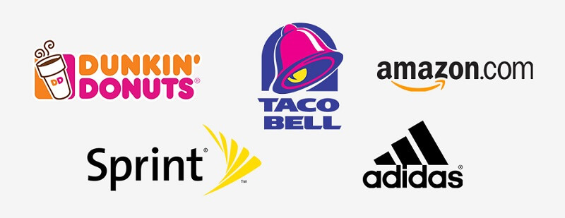
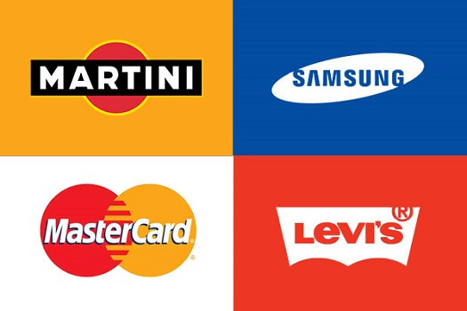
10. Fonts Inside a Shape
These logos simply consist of text in a shape, unlike the different kinds of logos. The text is nothing but the name of the brand. And the shapes can be a rectangle, squares, circles, octagons, and so on. Examples are MasterCard, Ford, etc.
A. When To Use Fonts Inside A Shape Logos
Use this logo if you want a simple logo, with your brand name clearly cited in it. These are long-C. lasting and memorable, hence being used by big brands from different industries.
B. How To Use Fonts Inside A Shape Logos
- Know About Your Brand Personality
Before you pick the elements of the logo, determine your brand’s personality and its objectives. - Choose The Right Shape & Font
After defining your brand personality, pick a shape and font for the logo. You have to be quite careful with the selection since there are only two elements in the logo. And both of them should together give your brand the desired personality.
C. Pros
- These types of logo designs are straightforward in conveying the brand name and persona.
D. Cons
- If brands are not particular in determining the right font and shape then it may result in a vague brand image.
11. Dynamic Mark
Dynamic marks are highly adaptive and one of the best types of logos. They do not have a specific font or shape and can be changed based on the required context. Examples are the City Of FedEx, AOL, etc.
A. When to Use Dynamic Marks
Dynamic marks are a useful choice for businesses with creative mottos, like media, entertainment, etc. Also, brands having different verticals, or wanting to deliver dynamism in their business can use these logos.
B. How To Use Dynamic Marks
- Effective Core Shape
The shape is pivoted here. Make sure that the core shape of the logo is unique, and remains the same. This is because it should look good even though the font, color, and style change. - Brand Message Remains Unchanged
In addition to the core shape, the brand message should remain unchanged. No matter what the color, font, or style is.
Also Read: Cafe Logo – Creative Cafe Logo Design Tips
C. Pros
- These logos are interesting and can fit the requirements of any medium.
- Unlike other different types of logos design, designers get the freedom to put their creativity into dynamic logos.
D. Cons
- In the absence of an impressive core shape, the brand message may be lost.
![]()
Also Read: How to find a perfect logo design company.
Final Thoughts- 11 Different Type Of Logos
The above list describes all types of logos with names, how and when to use them, and their pros and cons. Now that you know about all of them in detail, it will be easy for you to determine one for your brand. Choose an online maker if you are a new business and want to get things done on a low budget. Online logo makers are web applications that although come with limited options can create basic logo designs for you. In contrast, if you want to go bigger and better, to transform your logo idea into reality, get in touch with an expert logo design company.
Vervebranding is a leading logo design company in the USA/INDIA /UK that is catering to the branding needs of businesses for 11 long years. Send in your inquiries and let our professionals help you get the perfect logo for your business.
Read also:
Architecture Logo – Creative Architecture Logo Design Tips
Lawyer Logo – Creative Lawyer Logo Design Tips
Real Estate Logo – Creative Real Estate Logo Design Tips
Automobile Logo – Creative Automobile Logo Design Tips
E-Commerce Logo – Creative E-Commerce Logo Design Tips
Pharma Logo – Creative Pharma Logo Design Tips
Very informative blog! A logo is the identity and a visual mark for a brand. I’ll definitely use this knowledge in my next project. Thankyou for sharing this!
Your blogs are quite informative. I always get to learn something new and illuminating every time.
Thanks for sharing the best information, I am really enjoying reading your well written articles
Your logo is the first thing that consumers will see. Acting as the face of your business, it’s vital that you create a strong first impression, otherwise consumers may go elsewhere.
It is truly a practical blog to discover some various resource to include my knowledge.